Remuse
UX/UI Design

Remuse is a groundbreaking aesthetics app that empowers users to visualize potential cosmetic procedures on their own photographs. More than just a visualisation tool, Remuse bridges users with verified clinics and medical professionals, enabling informed and personalised decision-making around cosmetic treatments and surgery.
When Remuse approached Explosive Brands, they sought a brand identity that would reflect the deeply personal and often contemplative journey users take when considering cosmetic enhancements.
Our challenge was to craft a brand that felt warm, authentic, and inclusive: clearly differentiated from the clinical or overly stylised visuals that often dominate the aesthetics space.
At the core of our strategy was the understanding that cosmetic decision-making is as much emotional as it is aesthetic. We aimed to create a brand that honored this emotional nuance, evoking reflection, calm, and empowerment rather than vanity or impulse.
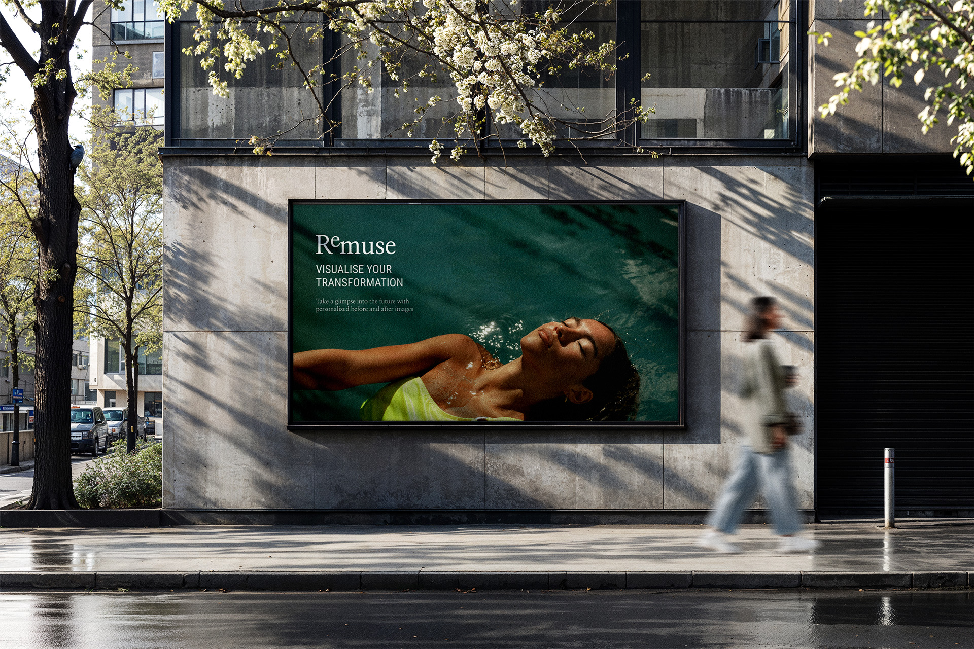
We anchored our creative concept around the name itself. The prefix “Re-” in Remuse became symbolic of the user journey: reflection, reconsideration, reimagining. This informed the logo design, which visually reinforces the cyclical and thoughtful nature of the app experience.
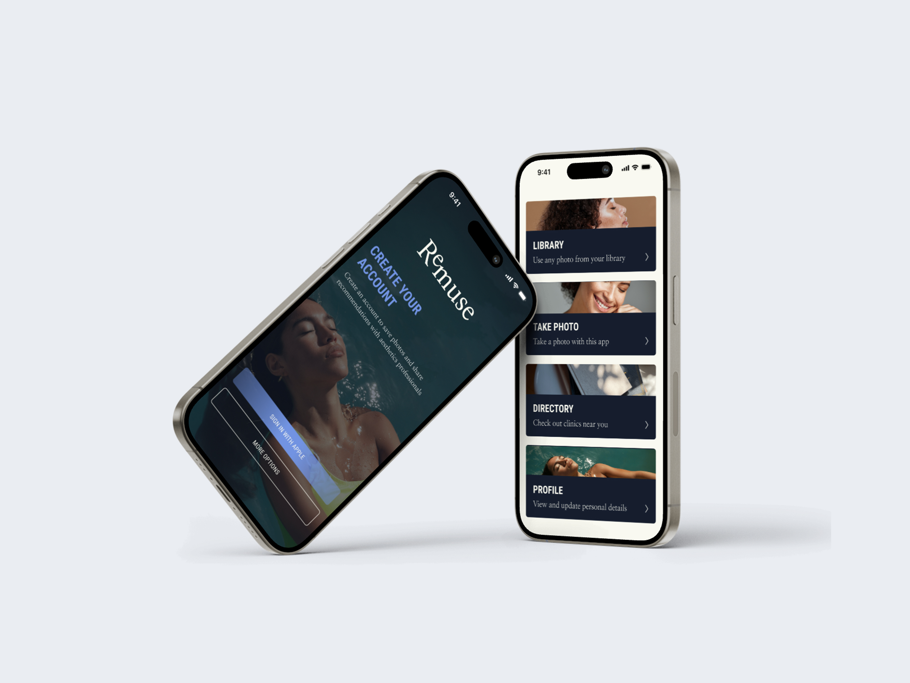
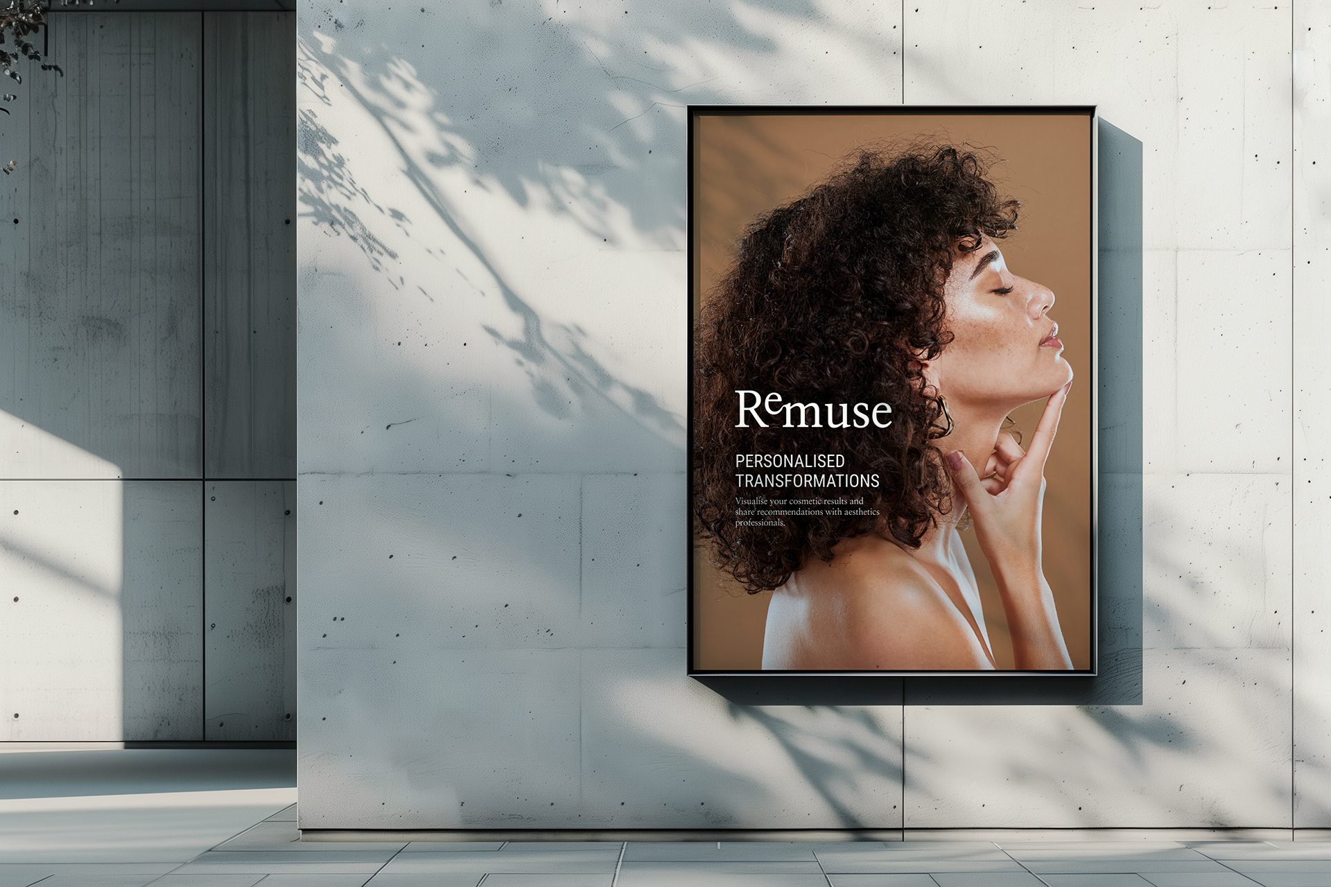
Our visual direction embraced warmth and authenticity.We curated a clean, minimal aesthetic centred around real, relatable imagery that celebrates natural beauty and personal narratives.
We deliberately avoided traditional stock photography in favour of visuals that convey genuine human emotion (smiles, contemplation, and quiet confidence) thereby building a deeper connection with the audience.

The colour palette was meticulously chosen to challenge conventional norms in the beauty and cosmetic industry. We moved away from traditionally feminine or overly polished hues and introduced a palette of sophisticated neutrals.
These tones communicate trust, professionalism, and inclusivity, positioning Remuse as a brand that respects diverse user experiences and empowers informed choices.

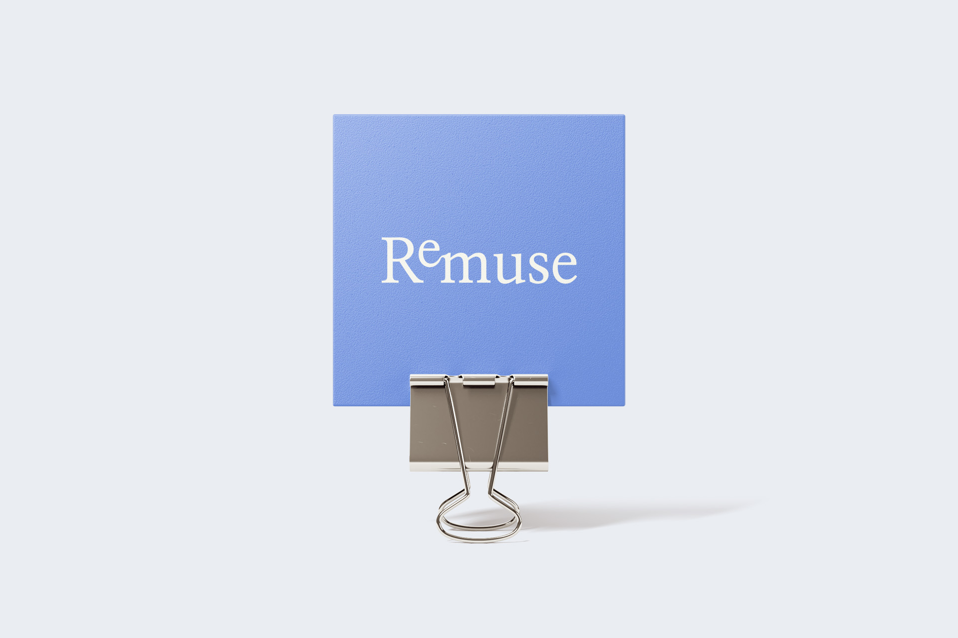
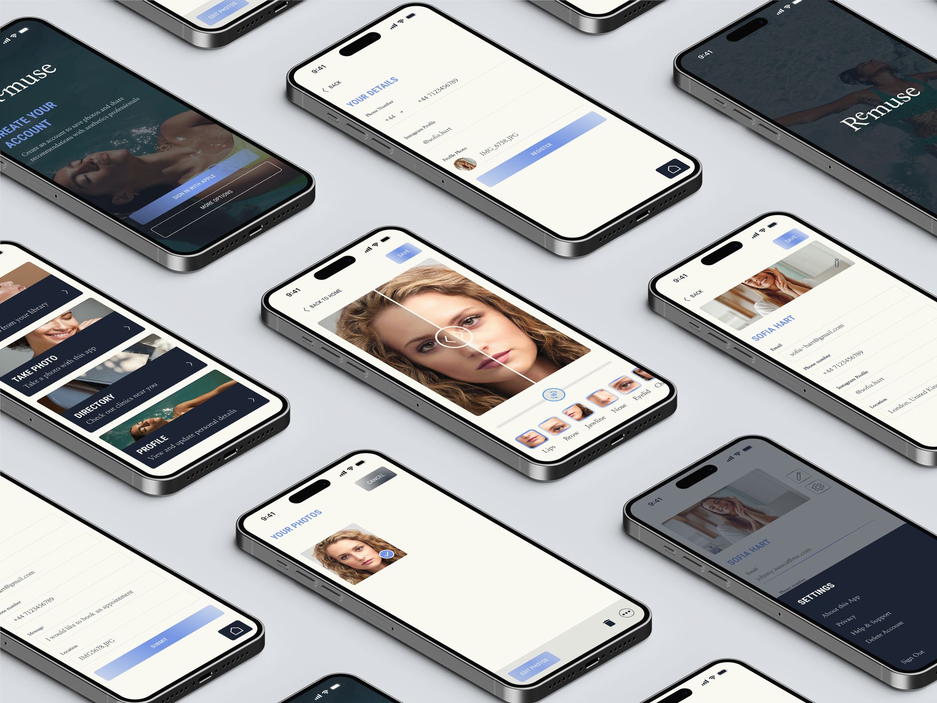
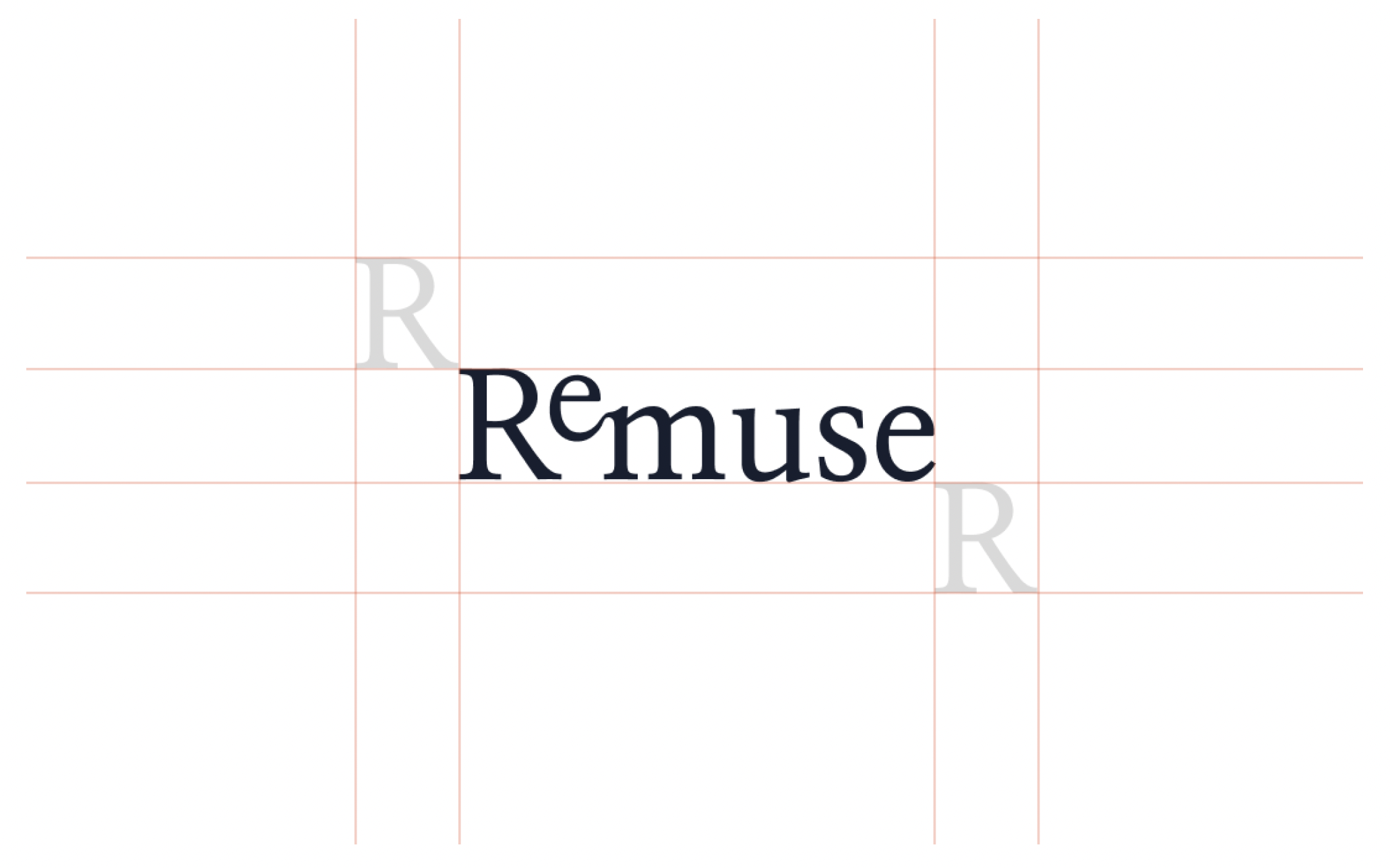
The Remuse logo is designed with simplicity and symbolism at its heart. The “Re” element is subtly emphasised to reinforce the brand’s narrative of thoughtful consideration.
We established clear logo usage guidelines, including a minimum clear space equal to the height and width of the “R” in the logo, ensuring clarity and impact across all digital and physical applications.
This attention to spatial integrity helps maintain the brand’s calm, composed presence; essential for an app that deals with deeply personal transformation.
The rebranding has ensured that Remuse now presents a cohesive, emotionally intelligent identity that resonates with
its target audience. The brand not only looks modern and polished but also tells a story of reflection, self-awareness
and empowerment.
A cohesive, emotionally intelligent identity that resonates with its target audience. The brand not only looks modern and polished but also tells a story of reflection, self-awareness, and empowerment.

The rebranding of Remuse stands as a testament to how design and strategy, when led by empathy and insight, can elevate a digital product into a powerful and trusted brand.


Contact us