The Curiosity Stack
Branding
The Curiosity Stack was founded with a belief that the team could take their specialist knowledge, forged from decades of problem solving, and package it into engaging and effective toolkits for managers.
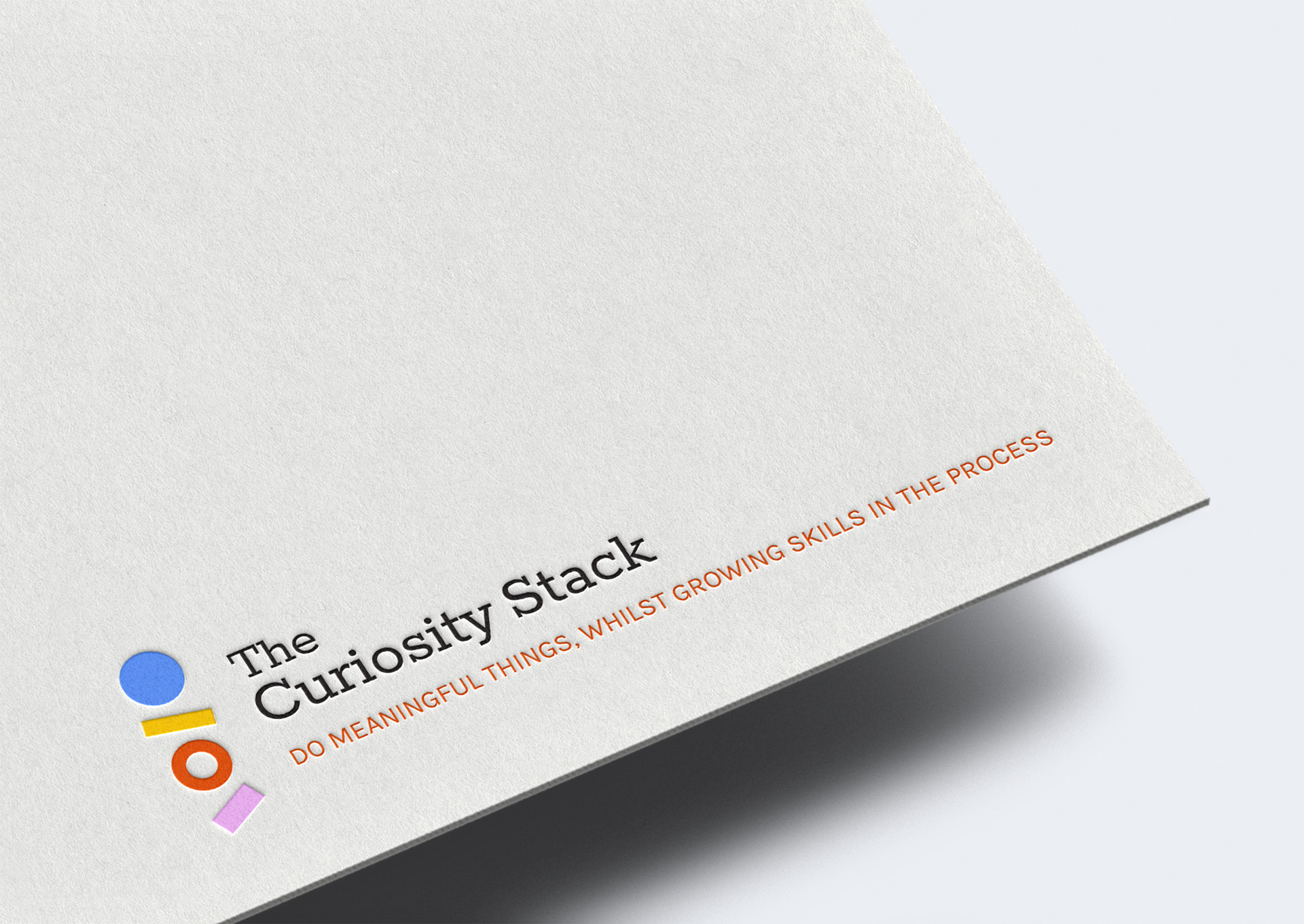
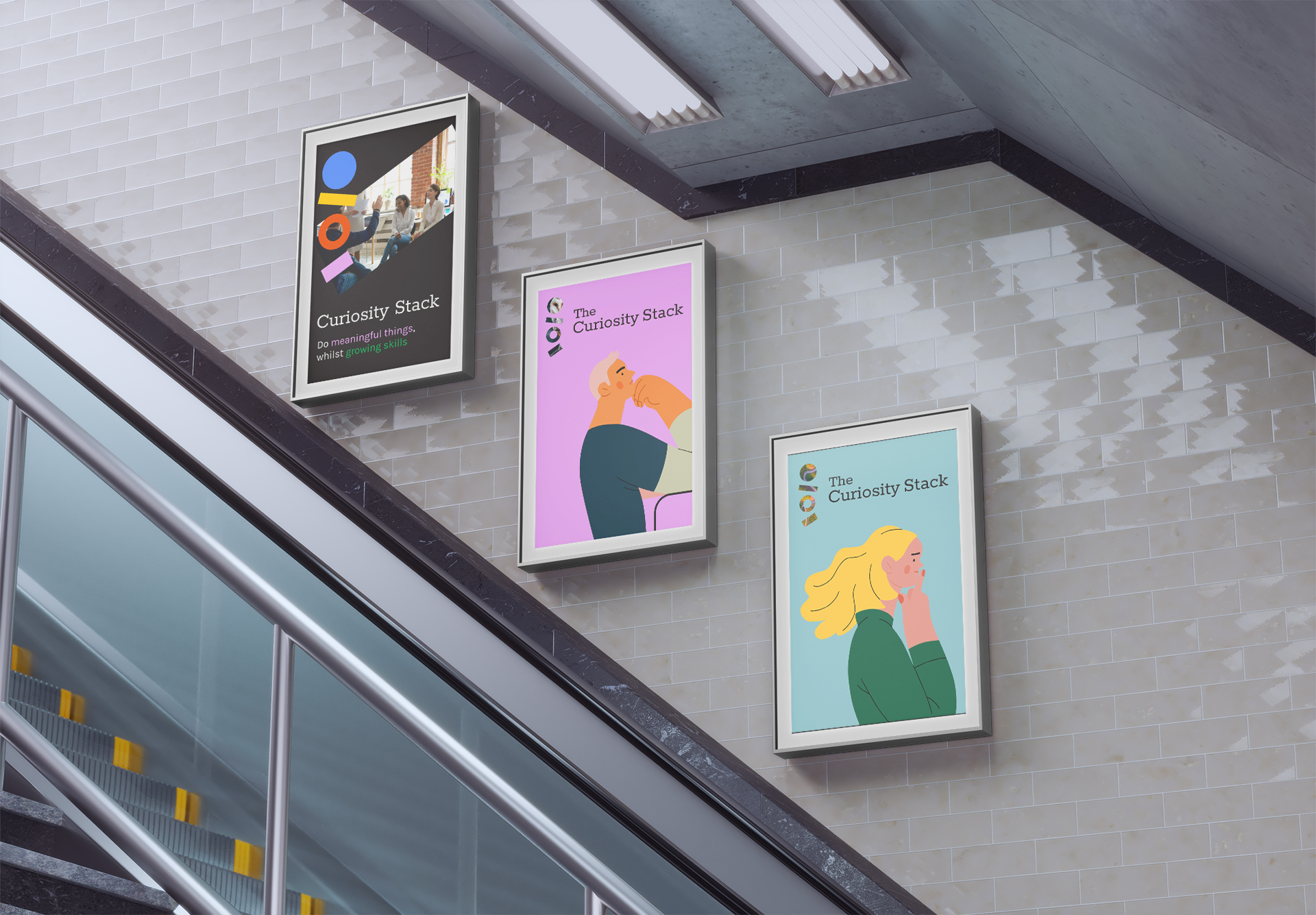
These toolkits will enable managers to do meaningful things, whilst growing their skills in the process.

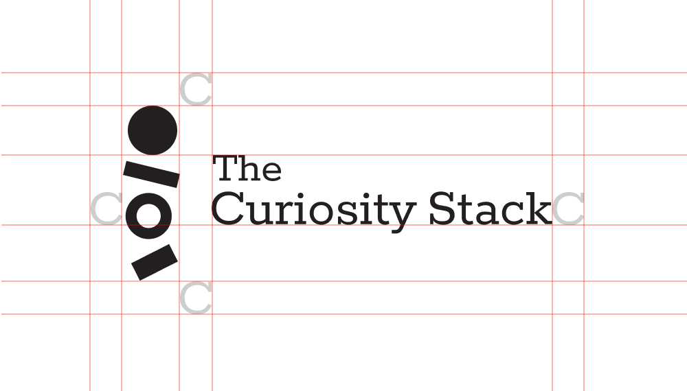
The Curiosity Stack logo vibrantly reflects the brand's dynamic ethos, symbolising flexibility, individuality and creativity through its varied angles and colourful stack of shapes. Each shape and colour reflects the diversity of training tools, learning paths and opportunities for growth, emphasising the flexibility and interchangeable use of the materials.
Designed to inspire managers, the logo promotes curiosity and innovation as keys to effective leadership and team growth.

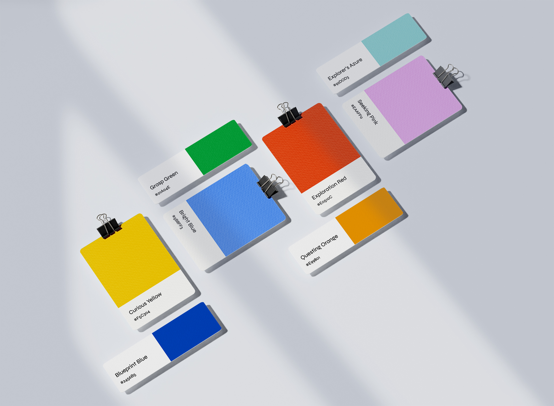

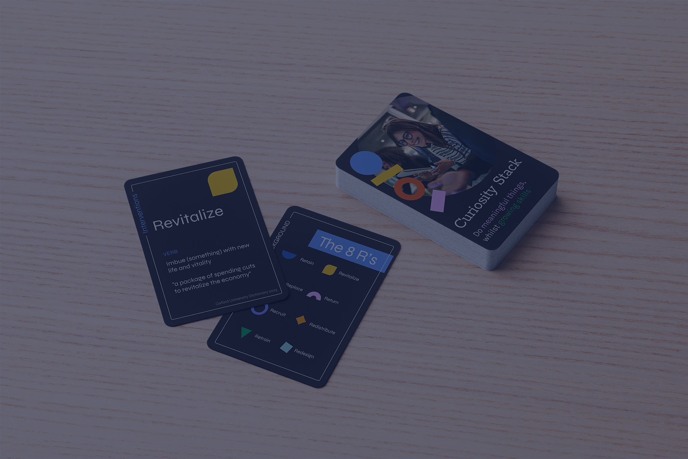
The Curiosity Stack shapes are a set of eight versatile forms that represent the brand’s modular and adaptable nature. Used as icons or layered elements in larger designs, these shapes unify the brand’s identity whilst at the same time celebrating individuality and exploration.
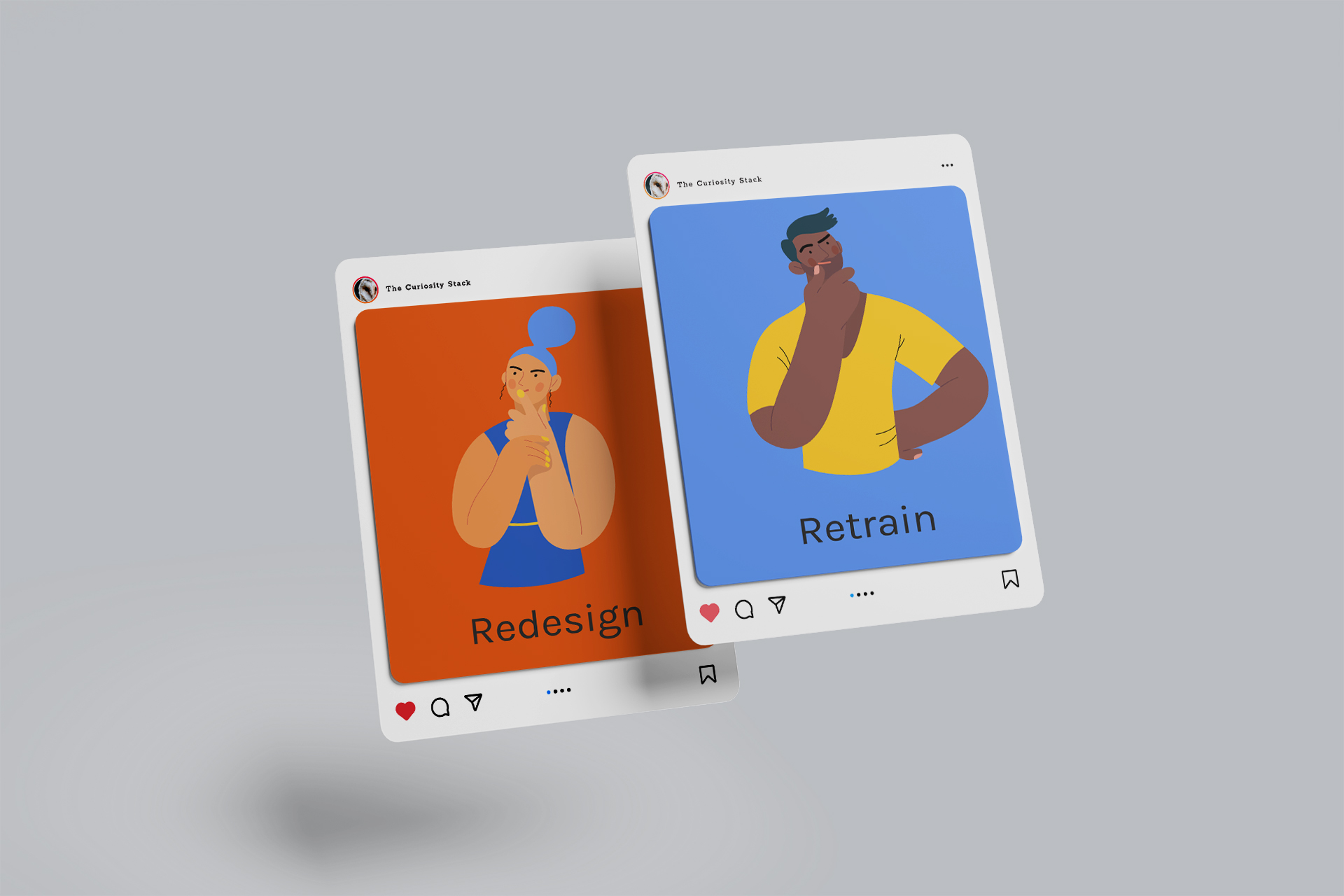
The Curiosity Stack illustrations embody curiosity and reflection, adding a human touch that complements the brand's approachable insightful tone. Expressive and dynamic, they enhance the learning experience, inspiring managers to both think deeply and explore creatively.

The below website showcases The Curiosity Stack branding assets in harmony, demonstrating how each element combines to create a cohesive and engaging visual identity.


Contact us