OVO Energy
Consumer App Redesign
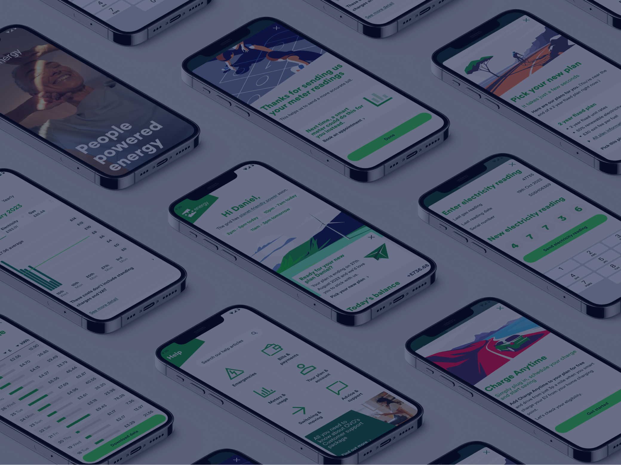
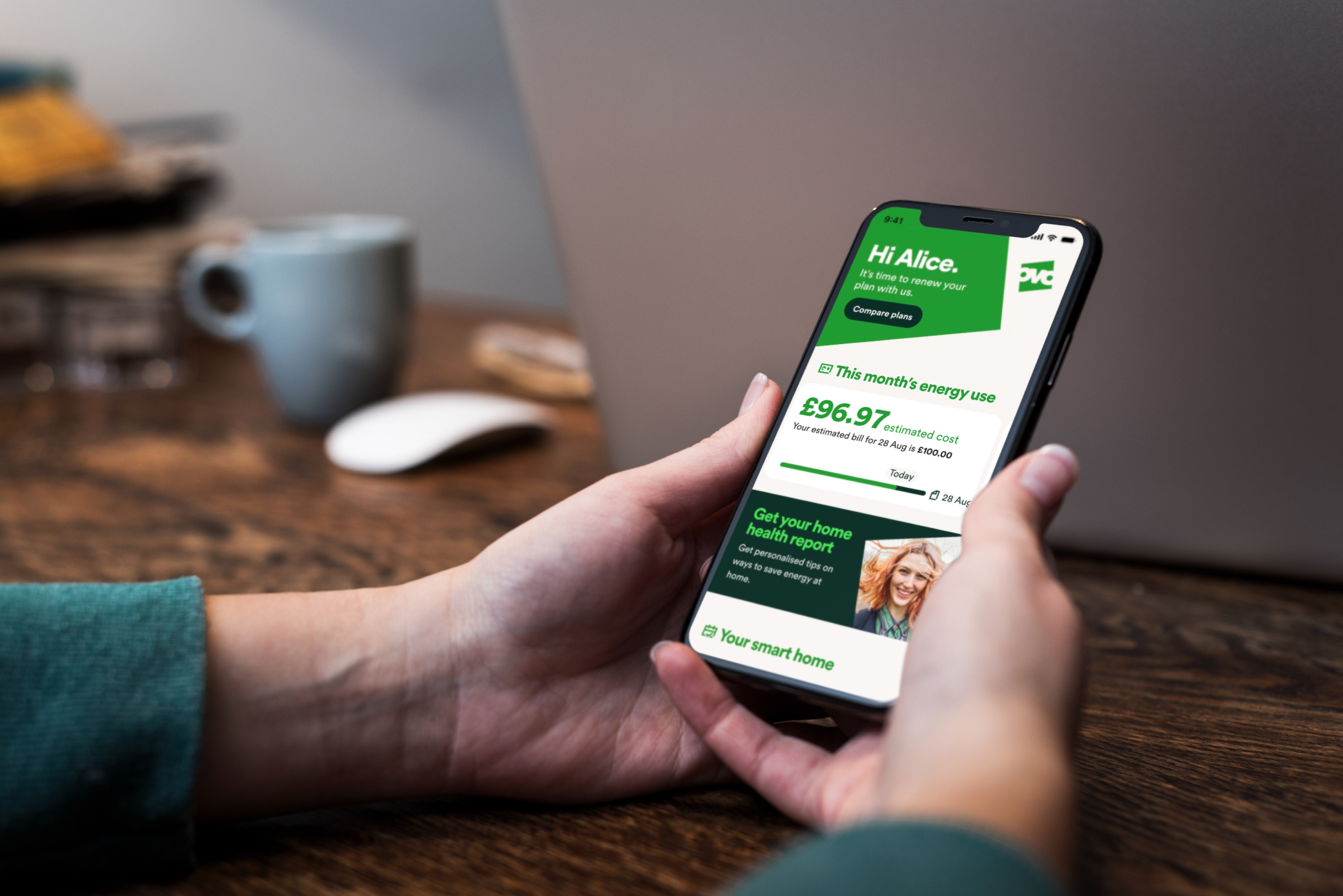
OVO, a leading energy provider,engaged us to overhaul their consumer app. Following the challenges posed by the energy crisis in 2022, they felt that they needed to re-evaluate how consumers interacted with energy-related information and services.
Lacking both a clear navigation structure and crucial features, such as transparent billing information, our goal was to undergo a complete and comprehensive redesign process that would result in a user-friendly app that customers would be happy to use.
The need for better consumer engagement and education regarding energy usage. The existing OVO app struggled with several issues:
Users reported difficulties navigating the app and accessing relevant information.
Consumers expressed frustration over the lack of clarity regarding their bills, both past and upcoming.
There was a need for an easier way for users to manage their direct debit settings.
In light of the energy crisis, users desired actionable tips to reduce their energy consumption.
To tackle these challenges effectively, we adopted a structured approach characterised by collaboration and iterative design processes:

A 12-week sprint plan, segmented into 2-week blocks, to ensure timely progress and milestone achievement
Clear milestones were established in collaboration with the OVO team to track progress and maintain alignment with objectives
We conducted qualitative user interviews and analysed user reviews to gain insights into pain points and preferences
The redesign process commenced with sketches and an audit of the existing information architecture to identify areas for improvement
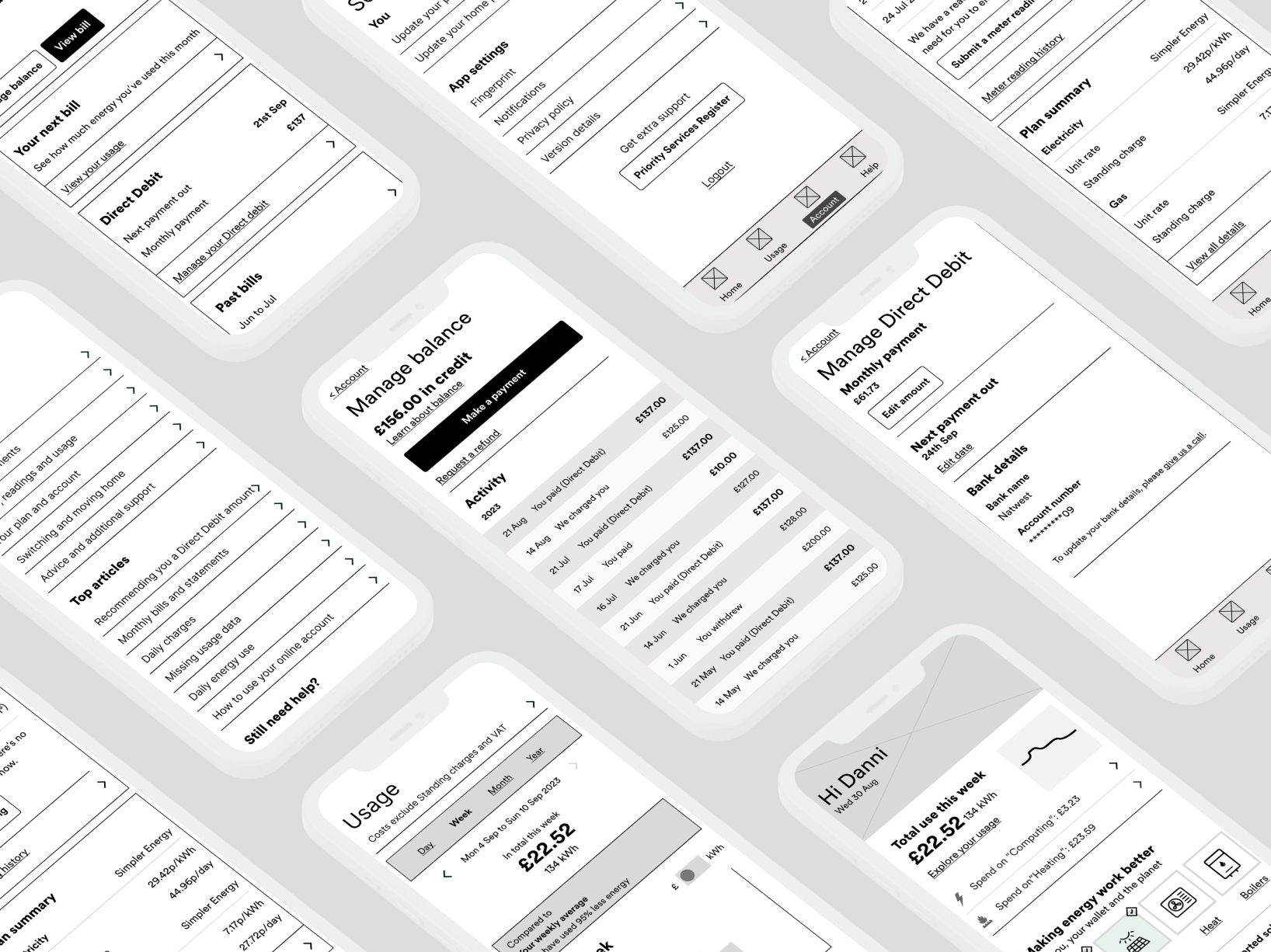
Rapid prototyping was done using Figma to explore design ideas and validate assumptions
Concepts were rigorously tested with users through both live interviews and unmoderated testing on usertesting.com
Feedback from testing sessions was incorporated iteratively to refine and enhance the design concepts

Our testing approach encompassed a blend of qualitative and quantitative methods to gather comprehensive feedback:
Live interviews allowed for in-depth discussions and observations with participants
Using “usertesting.com” we were able to gather feedback from a diverse pool of users
Live interviews allowed for in-depth discussions and observations with participants
Transcripts from interviews and testing sessions were analysed to identify recurring themes and sentiments among users
The redesign initiative yielded significant outcomes within the 3-month sprint cycle:
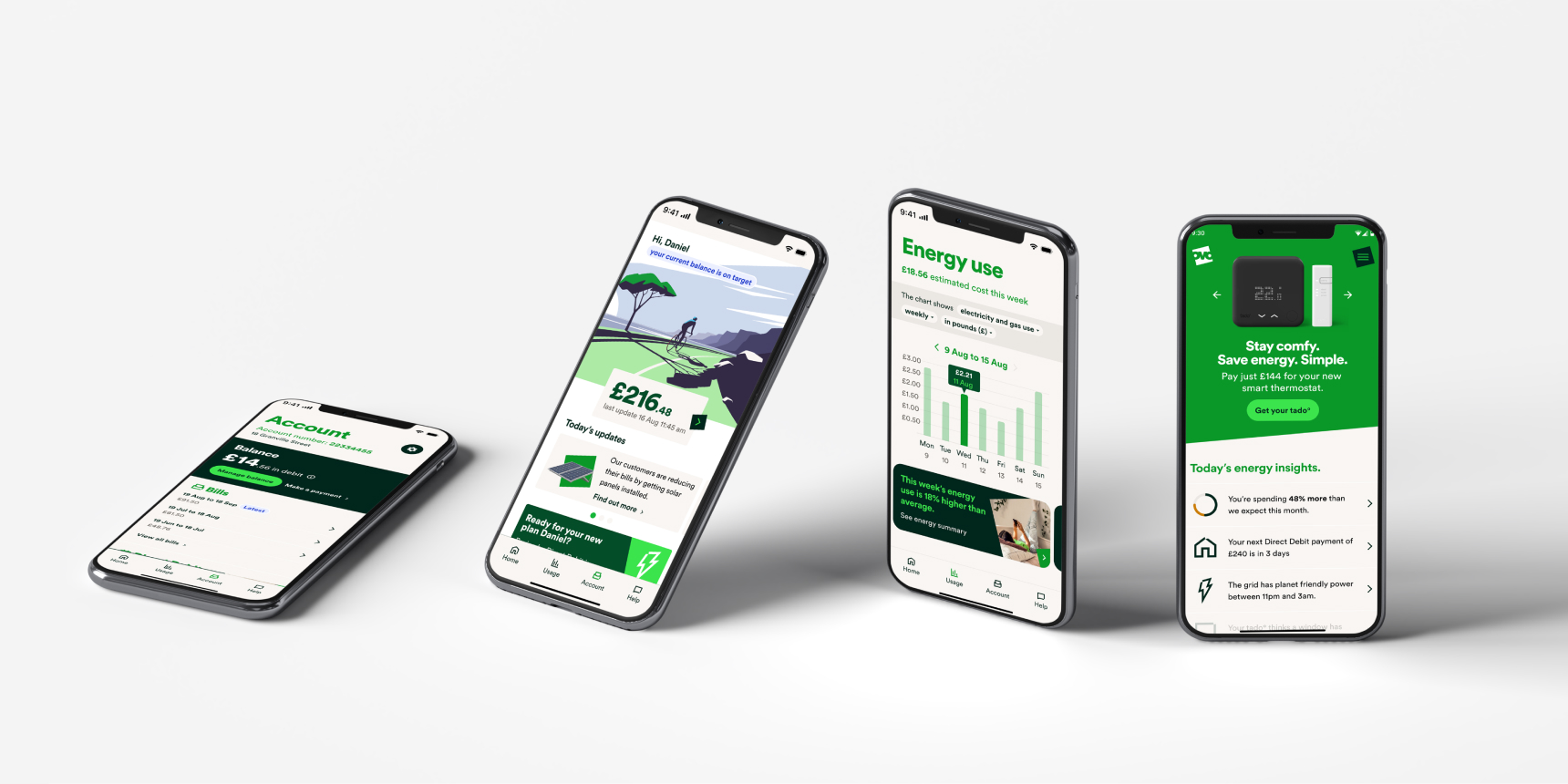
The redesigned app addressed usability issues and provided a more intuitive navigation experience
Multiple rounds of user testing ensured that the final design met user needs and expectations
A clear roadmap was established for future iterations, outlining enhancements and new features aligned with user feedback.


The redesigned app provided a foundation for integrating carbon-neutral technologies, in line with OVO's Mission Zero initiative
The redesign initiative yielded significant outcomes within the 3-month sprint cycle:
We were invited to continue collaborating with OVO to further enhance the app and explore additional feature sets
We embarked on testing innovative concepts that aligned with OVO's broader ecosystem, including synergies with insurance products offered by OVO and its partners


Contact us