What do red telephone boxes, a charity rebrand, Wallace & Gromit and Pokémon at the Natural History Museum have in common? They all show how design seeps into our culture and sticks. Unintentionally, many of the topics we've been discussing in the studio lately have had a distinctly British feel. So we decided to write a bit of a love letter to British visual culture, from analogue slide archives and road signs we barely think about to red phone boxes and the stop-motion heroes we grew up with.

Starting off with a huge dose of inspiration, courtesy of Luke Charles’ rebrand for the Motor Neurone Disease Association. Built around the idea that 'Every Day Matters', the identity carries both urgency and humanity, something that feels incredibly important for a condition that moves fast and has no cure.
At the heart of the design is a fingerprint motif forming the ‘D’ in the logo. It’s a simple but powerful gesture, no two fingerprints are the same, just as no two people experience MND in the same way. Six unique prints represent the six people diagnosed every day, a shocking statistic translated into something deeply human. We particularly loved the subtle animations, used across the branding, that bring it to life in applied settings, adding movement and emotion without overwhelming the message. It’s thoughtful, restrained and very impactful.

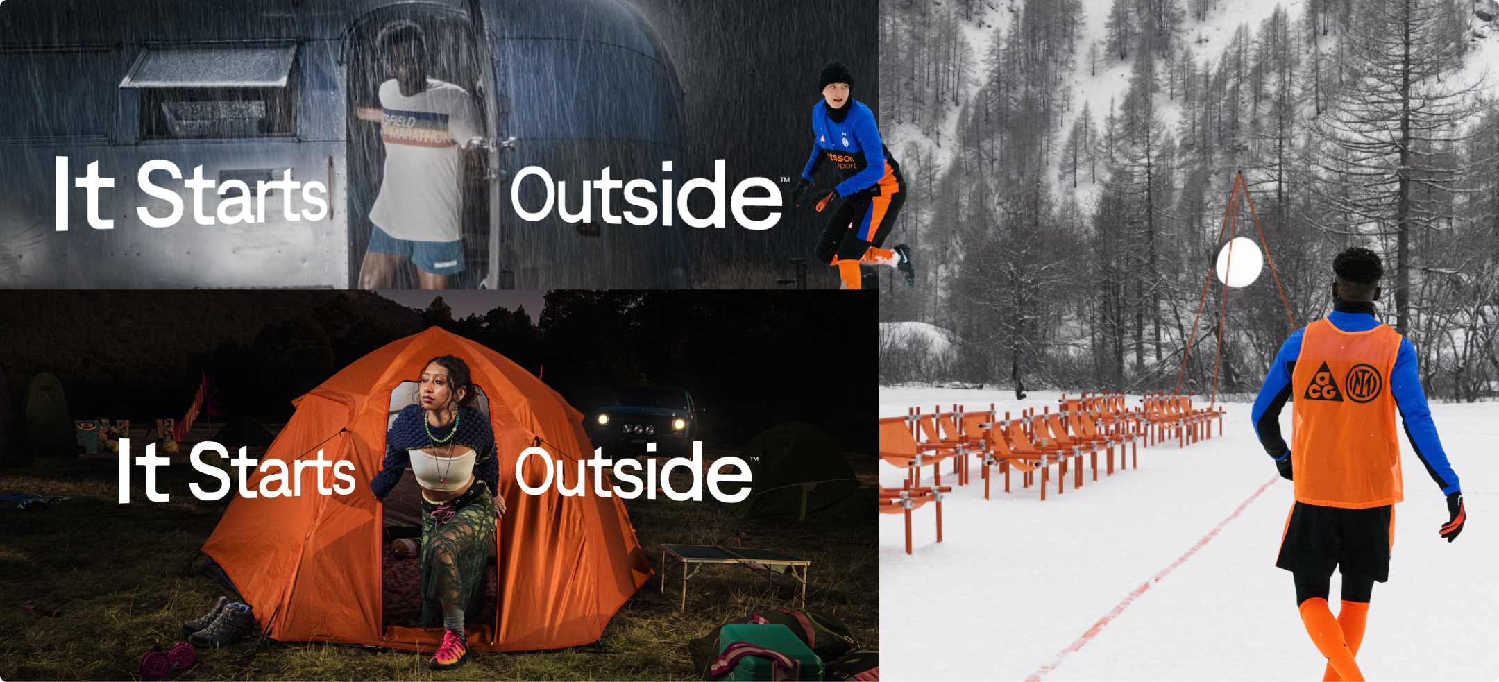
Moving from empathetic restraint to full-throttle disruption, Bloom’s rebrand for UK drinks brand Tango couldn’t be louder and that’s exactly the point. The new look genuinely stopped us mid-scroll, it feels less like traditional drink packaging and more like a banner for a gaming convention or a streetwear pop-up. It all clicked for us, when we realised who it’s for. Aimed at Gen Z and Alpha, the identity reflects what this audience wears, watches and shares. Dynamic typography crashes through frames, colours clash confidently and the photography feels spontaneous and up-close, almost chaotic in the best way.
In a category often dominated by safe, global sameness, Tango’s new system feels culturally relevant and unapologetically bold. It’s bright, disruptive and attention-grabbing and honestly, it makes us want to try the drink. If the goal was to jolt a chronically online generation back into the real world, this feels like the way to do it!

This book is a beautifully nostalgic snapshot of post-war British design. Curated from over 22,000 original 35mm slides created by the Council of Industrial Design, it captures everything from consumer products to engineering icons once projected as examples of “good design.”
With its analogue glow and time-capsule feel, it’s the kind of coffee table book we’d love in the studio, a reminder of Britain’s optimistic, design-led past and a reliable source of inspiration when we need it.

On the topic of quintessentially British, the V&A’s Inside Aardman: Wallace & Gromit and Friends exhibition celebrates 50 years of stop-motion brilliance. Painstaking clay models, original sets and sketches, the selection shows us a behind-the-scenes look at the craft that made these characters cultural icons.
For some of us, it brought warm childhood memories, while others felt inspired to watch the movies, before visiting the collection. There’s something timeless about Aardman’s tactile storytelling, a proof that personality, patience and plasticine still hold serious creative power.
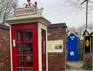
We can’t talk about British design and not mention that it’s been 100 years since the iconic red telephone box first appeared on our streets. However, now it carries more nostalgia than necessity, so we were fascinated when we learned that there is a National Telephone Kiosk Collection at Avoncroft Museum in Worcestershire.
With around 30 restored kiosks they tell the story of how the phone box became such a defining part of the UK streetscape. From early concrete designs that didn’t quite win public affection to Sir Giles Gilbert Scott’s cast-iron classic (originally imagined in green), we see the evolution of the kiosk as a reflection of the changing aesthetic preferences, technological developments and British identity.
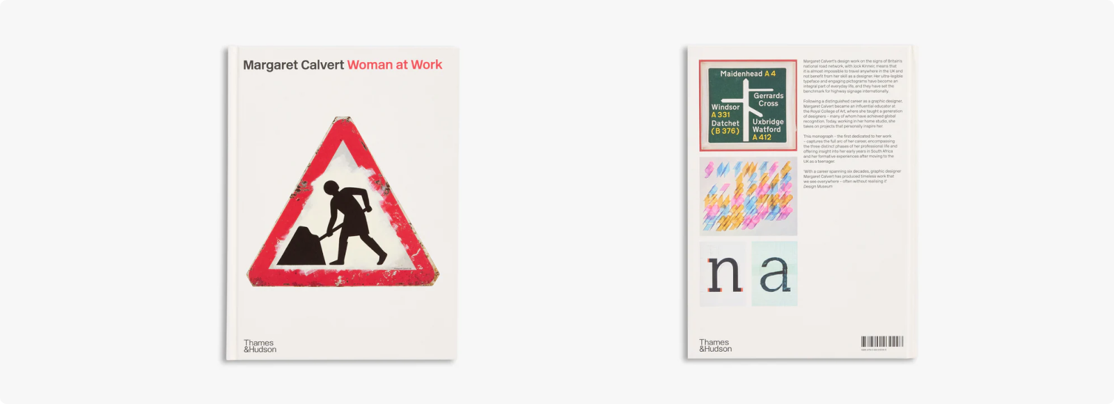
We also had to mention a new book that caught our attention: Margaret Calvert: Woman at Work, published by Thames & Hudson. It shines a spotlight on the designer who helped shape the visual language of modern Britain, without many of us even realising it. Alongside Jock Kinneir, Calvert developed the UK’s road signage system, introducing lower-case lettering, clear typography and colour coding designed for high-speed reading. Logical, legible and quietly beautiful, it became a national shorthand we barely even notice.
The book traces Calvert’s journey from South Africa to post-war Britain, where she spent decades refining the systems that guide millions on our journeys every day. It reminded us that, as we often say, quiet design often has the biggest impact, it’s functional, enduring and woven into everyday life.

To end on a playful note, Pokémon has landed at London’s Natural History Museum. The “Pokécology” pop-up reimagines the beloved characters through a natural science lens, blending childhood obsession with institutional credibility in a way that feels unexpectedly perfect.
With Pokémon cards recently making headlines for record-breaking sales, it does make us wonder if it’s finally time to see what all the fuss is about (perhaps our team-mates with children).
Nostalgia, collectability and cultural lasting power, maybe there’s more design legacy in those little creatures than we realised!
Thanks for reading. Make sure to check out our other blog posts and subscribe to our Substack for more studio thoughts on design, culture and creativity.
Contact us