Lifelight
Branding & Website Redesign

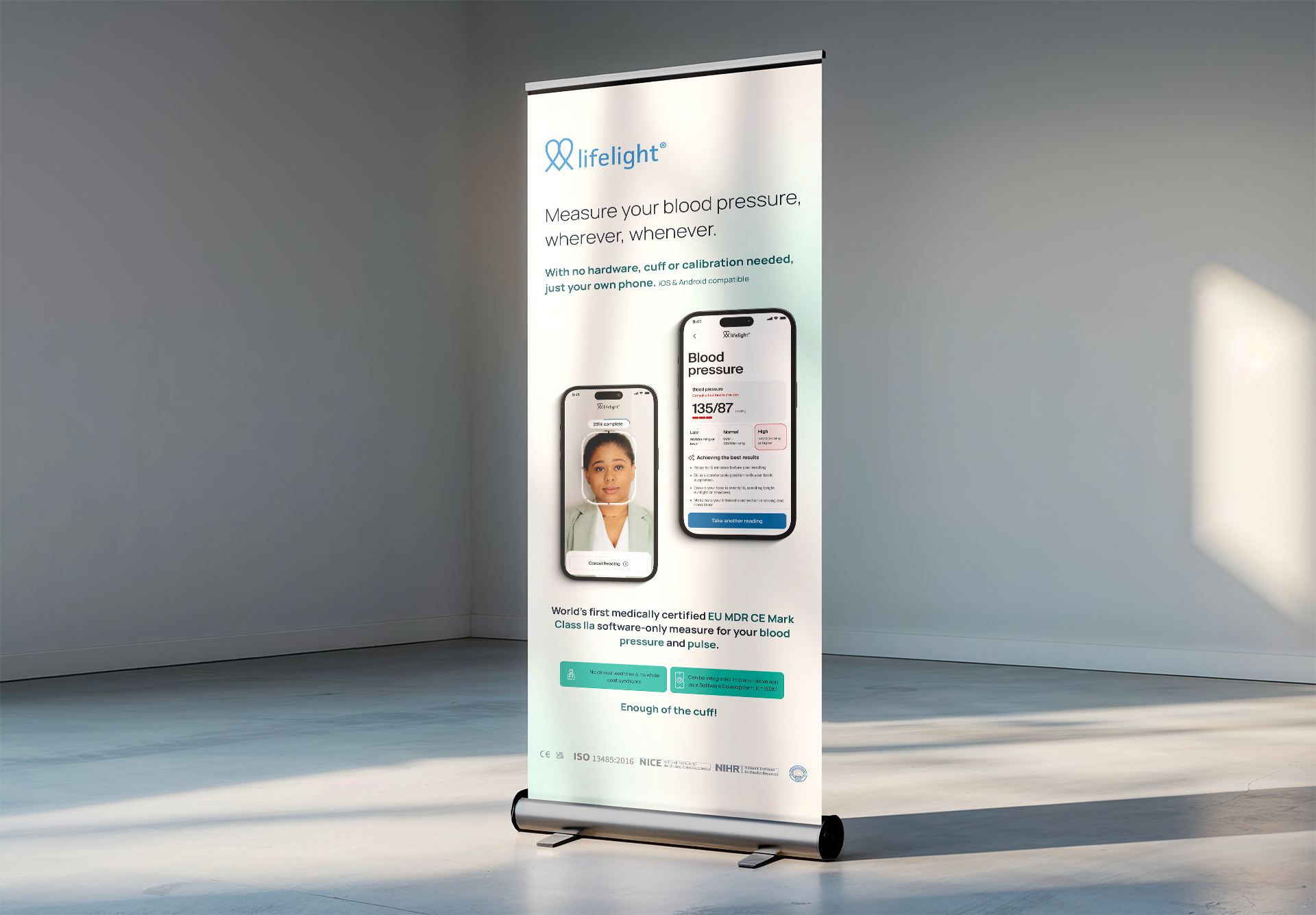
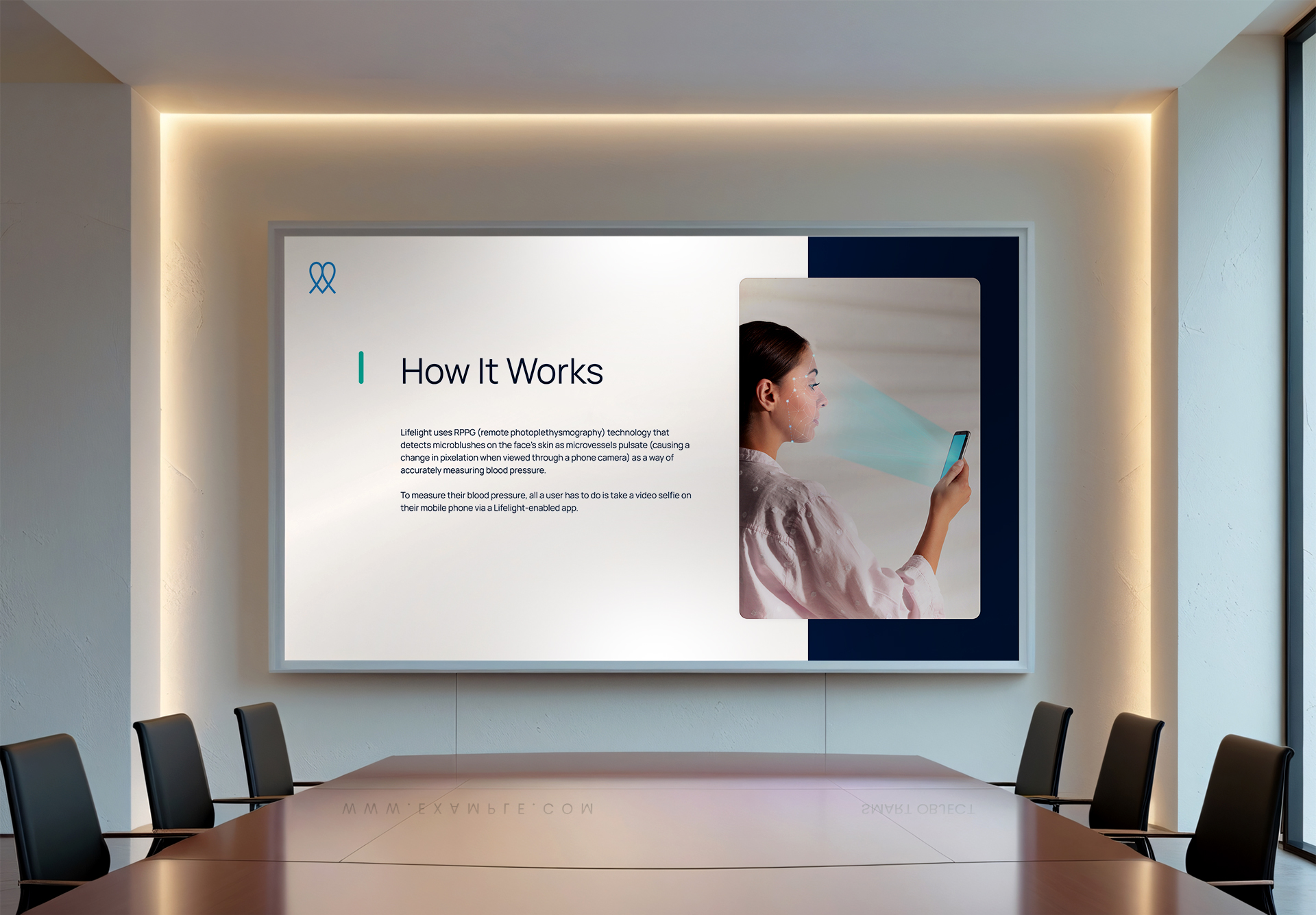
Lifelight is redefining health diagnostics by turning any smartphone into a powerful, contactless health screening tool. By scanning a user’s face, Lifelight can provide real-time insights into blood pressure, pulse, and indicators of other medical conditions instantly, and without the need for external hardware.
Lifelight’s pioneering technology deserved a digital presence that matched its ambition. While the existing site served a functional purpose, it presented an opportunity to create a more cohesive brand experience, one that would better communicate the innovation, credibility, and impact at the heart of Lifelight’s mission.

To reimagine Lifelight’s digital presence, build trust, and translate complex medical technology into a brand story that felt both accessible and cutting-edge.

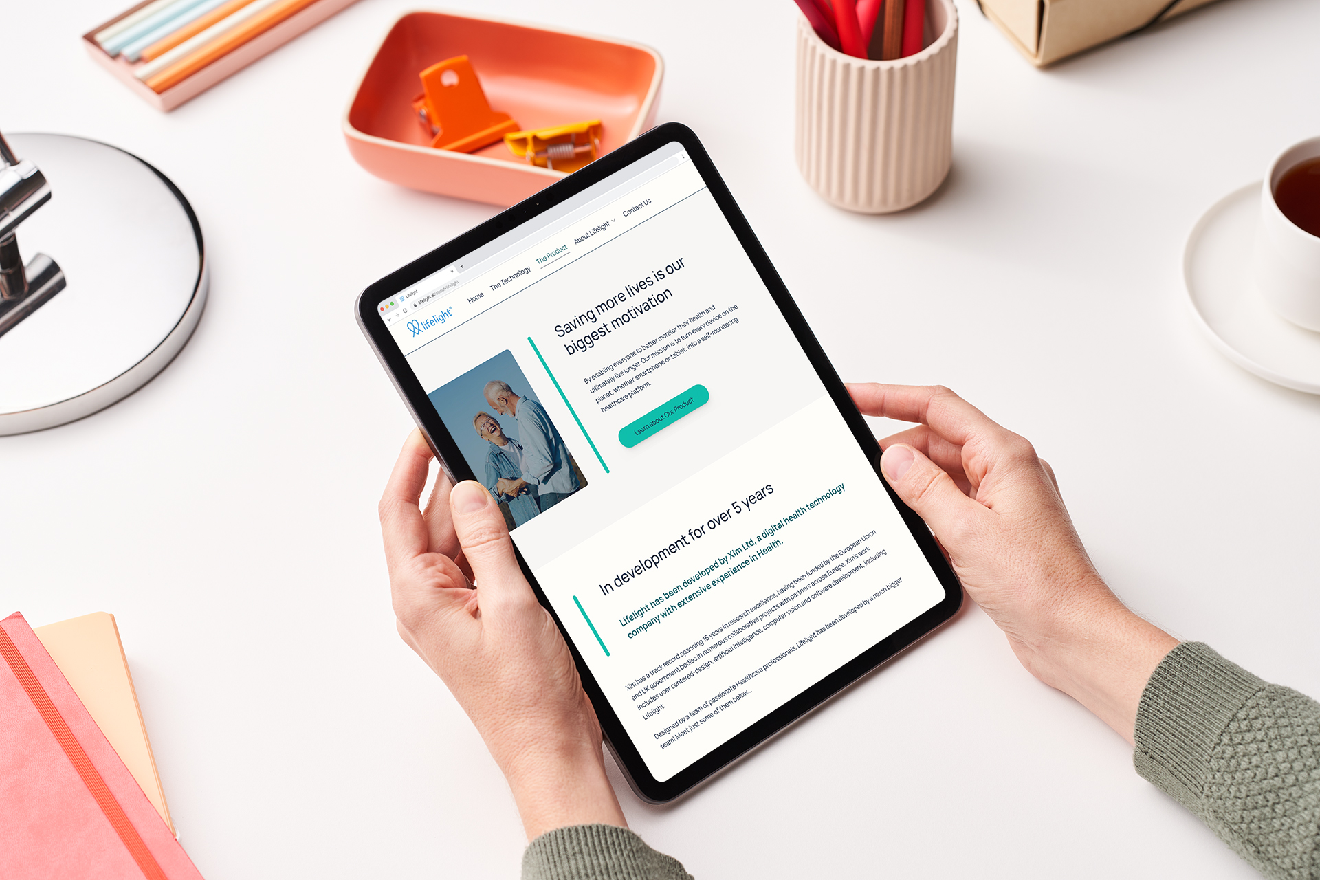
We began by auditing the existing website and brand materials. One of the most critical issues was narrative clarity; the old site overwhelmed users with technical jargon and scattered messaging. To resolve this, we developed detailed wireframes that introduced a new content hierarchy, guiding visitors through a compelling and easy-to-follow brand story starting from the homepage.
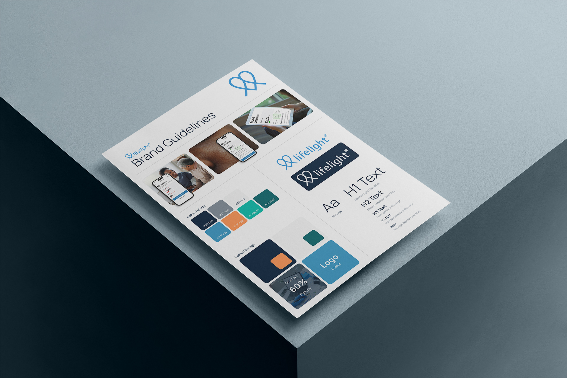
In parallel, we expanded the visual identity. Lifelight already had a recognisable color palette, but it was limited in versatility. We introduced complementary shades and gradients to create more visual depth and flexibility across digital platforms. The design direction aimed to be modern, clean, and trustworthy; an essential combination for a brand operating in the medtech space.
Key design updates included the introduction of the Manrope typeface. Selected for its modern yet approachable aesthetic, Manrope strikes a balance between scientific clarity and everyday friendliness, making it ideal for medical technology that speaks directly to consumers.

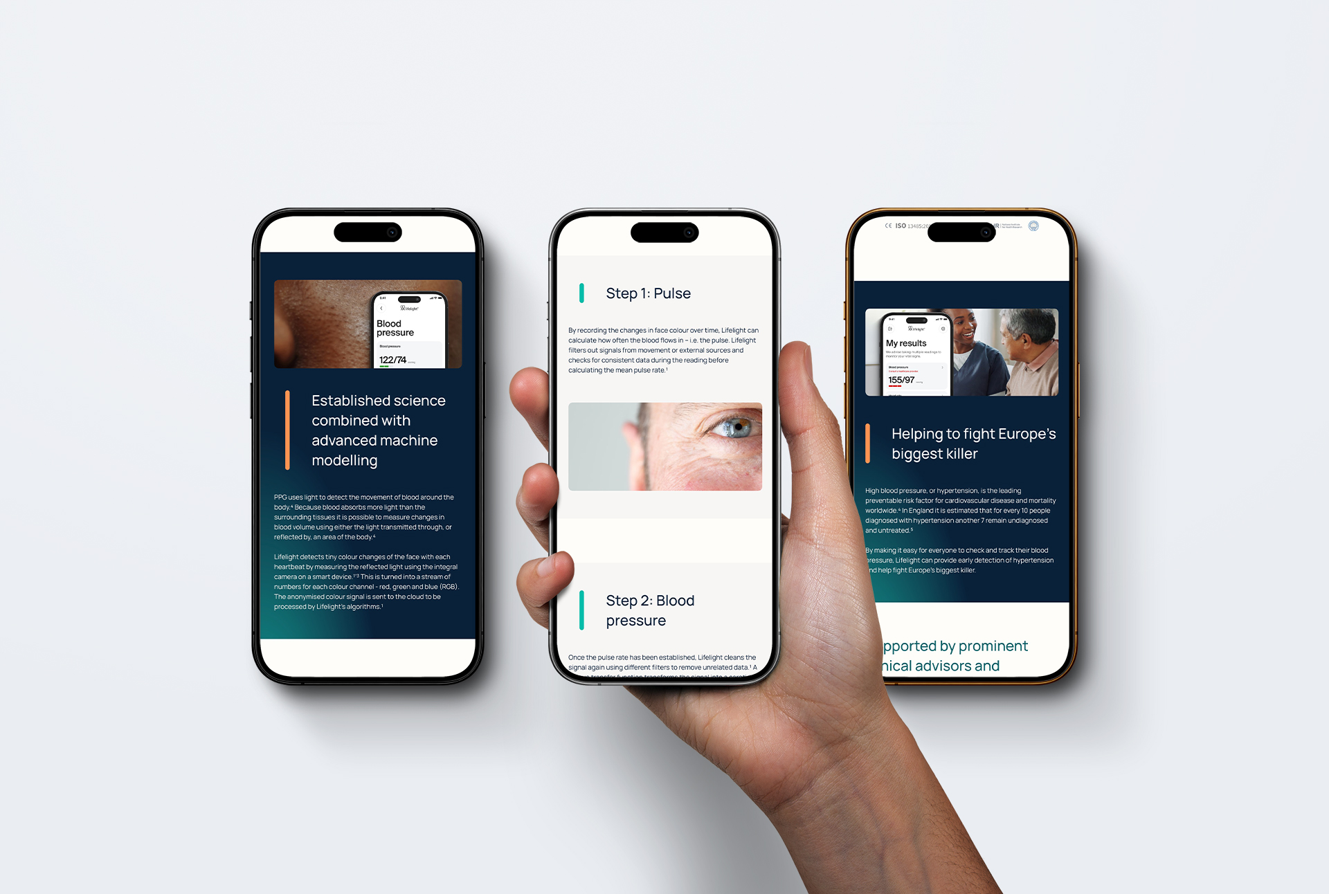
We also integrated subtle gradient textures across the site to add visual interest without distracting from the core messaging. These were paired with rich imagery that focused on the product in use, which was an important shift from generic stock photos to authentic scenarios.
One of our biggest challenges was making Lifelight’s advanced health diagnostics understandable to the everyday user. To solve this, we partnered closely with medical writers who helped us distill technical concepts into engaging, readable content. The result is a site that feels intuitive and informative without sacrificing scientific accuracy.
The redesigned Lifelight brand now reflects the innovation behind the technology and builds trust with users through clarity, confidence, and credibility. The refreshed visual identity feels both modern and medically appropriate, setting Lifelight apart in a competitive market.
Post-launch feedback from users and stakeholders has been overwhelmingly positive. Engagement is up, bounce rates are down, and most importantly, the brand now resonates with its target audience, both medically informed professionals and curious consumers alike.


Contact us