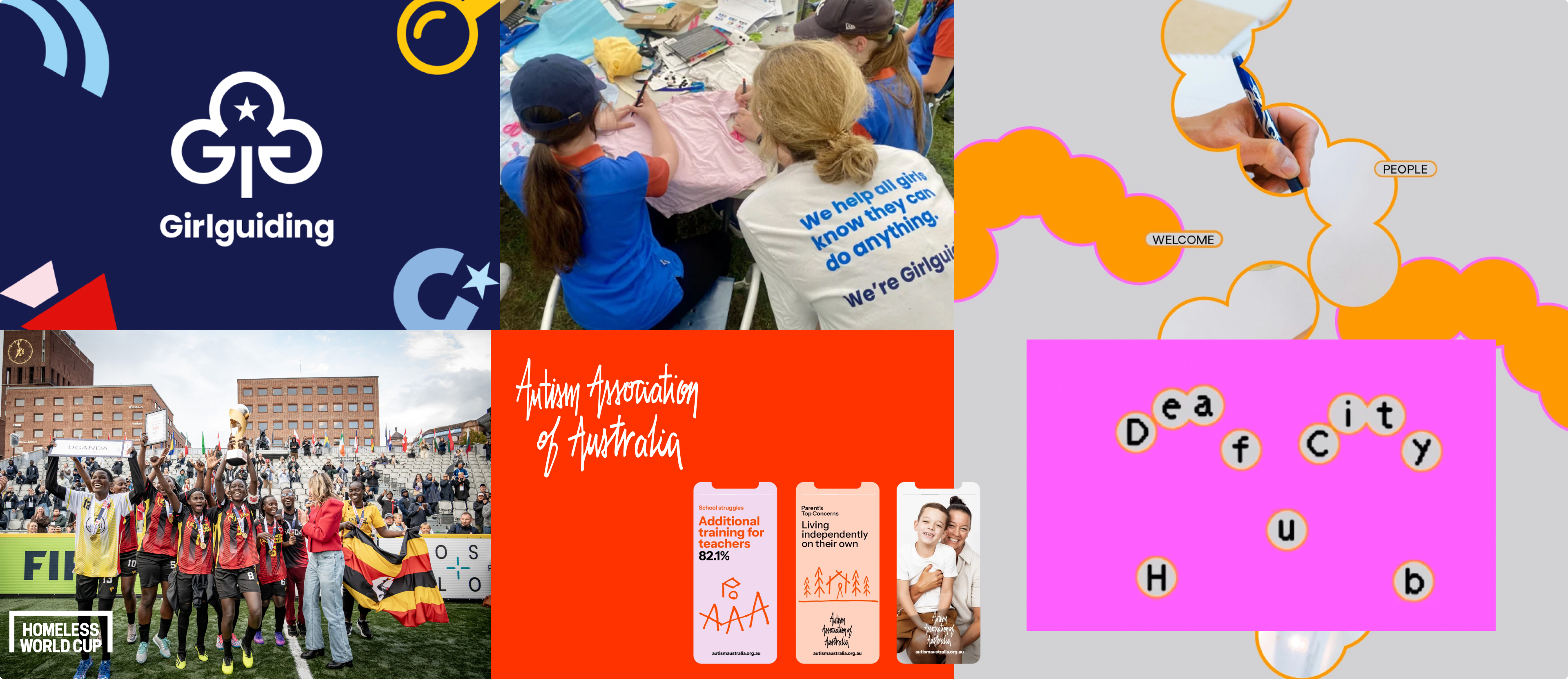
At Explosive Brands, we strongly believe design is at its best when it serves a purpose bigger than itself. As a creative, design and communications studio in London, we're always drawn to work that gives something back to our community and a few recent projects caught our attention for exactly that reason.
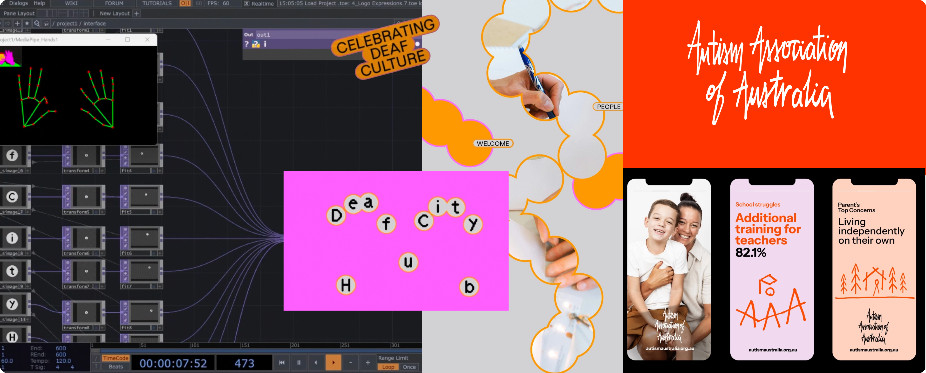
First, the Autism Association of Australia, formerly Autism Awareness Australia. The name change signals that awareness is no longer enough. With autism diagnosis rates at a record high and families navigating a fragmented, exhausting system, the organisation needed a brand that matched the seriousness of the fight ahead. The pro bono brand transformation by FutureBrand, which they estimate is worth over $100,000, leans into the handmade, human design trend we've been talking about a lot lately. It is warm, textured and distinctly un-corporate, with clear colour distinctions across the website that make it genuinely easy to navigate. For an organisation supporting over 538,000 Australians a year, that really matters. It's design giving back to the community, helping real people who really need it.
That spirit of community-led thinking runs through the rebrand of DeafCity Hub by agency Templo, one of the most original pieces of identity work we've seen in a long time. Rather than choosing a typeface, Templo used motion-tracking technology to capture real hand movements inspired by British Sign Language, then built the entire lettering system from those gestures. The result is a logo that moves the way its community communicates. Paired with a hot pink and bright orange palette that feels more nightclub flyer than charitable organisation, the identity is joyful, loud and very intentional. Accessibility definitely isn't an afterthought here, it's the creative foundation the whole project is built on and a great reminder that the best design brief is often the community itself.
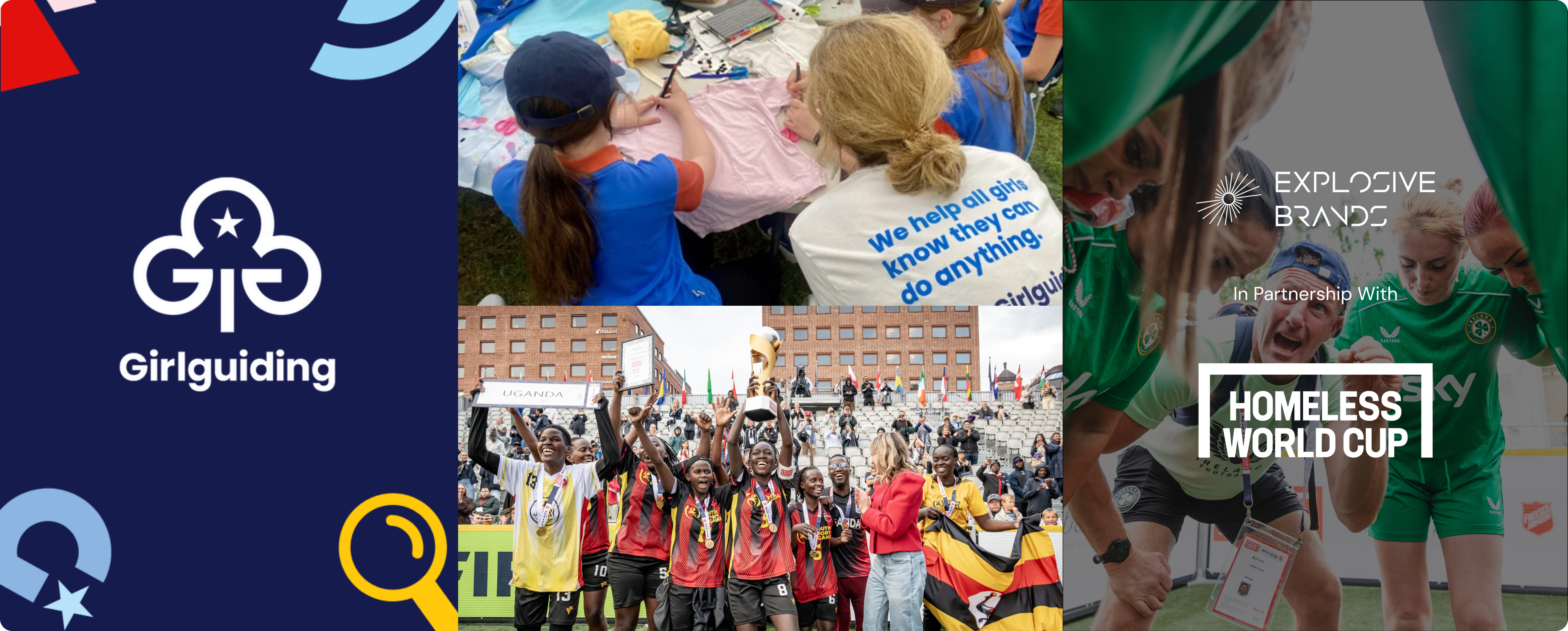
Listening is also what won us over in Girlguiding's first uniform redesign in over 30 years. The new look is pink with rainbow stripes, a bright and unmistakably fun choice, but it's how they got there that especially delighted the UI/UX designers in our team. Working with HemingwayDesign, experts in inclusive and sustainable design, Girlguiding gathered input from nearly 55,000 members through surveys, focus groups, dream design workshops and hands-on sessions with girls from all backgrounds. The data is displayed openly on their website, for anyone that's curious, and it led directly to the winning design. Real user research at that scale is rare, especially when it comes to children. Adults don't often land on rainbow stripes but the girls absolutely did.
Each of these projects shows that great design starts with the people it's actually for. It's a belief that sits close to our own work and we're proud to be putting it into practice with the Homeless World Cup, alongside Genius Sports. As football fever built up around the 2026 World Cup, the Homeless World Cup Foundation is asking the global football community to come together for something bigger than the game. The goal is to fill The Impact Stadium, a virtual stadium with 115,000 seats, matching the record crowd at the 1986 World Cup Final at the Estadio Azteca. If every seat is filled, together we could help change 5,000 lives across 75 countries through football, belonging and opportunity. It's a cause we believe in deeply - take a seat, change a life.
Have a project with purpose? Get in touch to talk about how design can help.

Contact us
.svg)
.svg)