Every now and then, we come across design work that makes us pause, projects that don’t just look great, but truly show a brand who knows how to connect with its audience. Two recent examples have caught our eye for doing exactly that, in very different worlds: live sports and whiskey.

Sky Sports has unveiled a fresh visual identity and we’re big fans. The rebrand moves away from sport-specific sub-brands to create one unified, dynamic look that feels bold, confident and ready for a new generation of viewers.
At the heart of the redesign is Sky Sports Sans, a custom typeface created with the F37 foundry. With five weights and a crisp, legible design, it brings consistency across platforms while giving Sky a sleek new look. The result is a system that’s flexible yet unmistakably Sky, capable of handling everything from Formula One to the Ryder Cup without losing its voice.
It’s a great reminder that even in motion-heavy, content-led environments, typography can be the real MVP. It gives rhythm, emotion and shape to how a brand communicates and Sky Creative and Nomad Studio have absolutely nailed it.
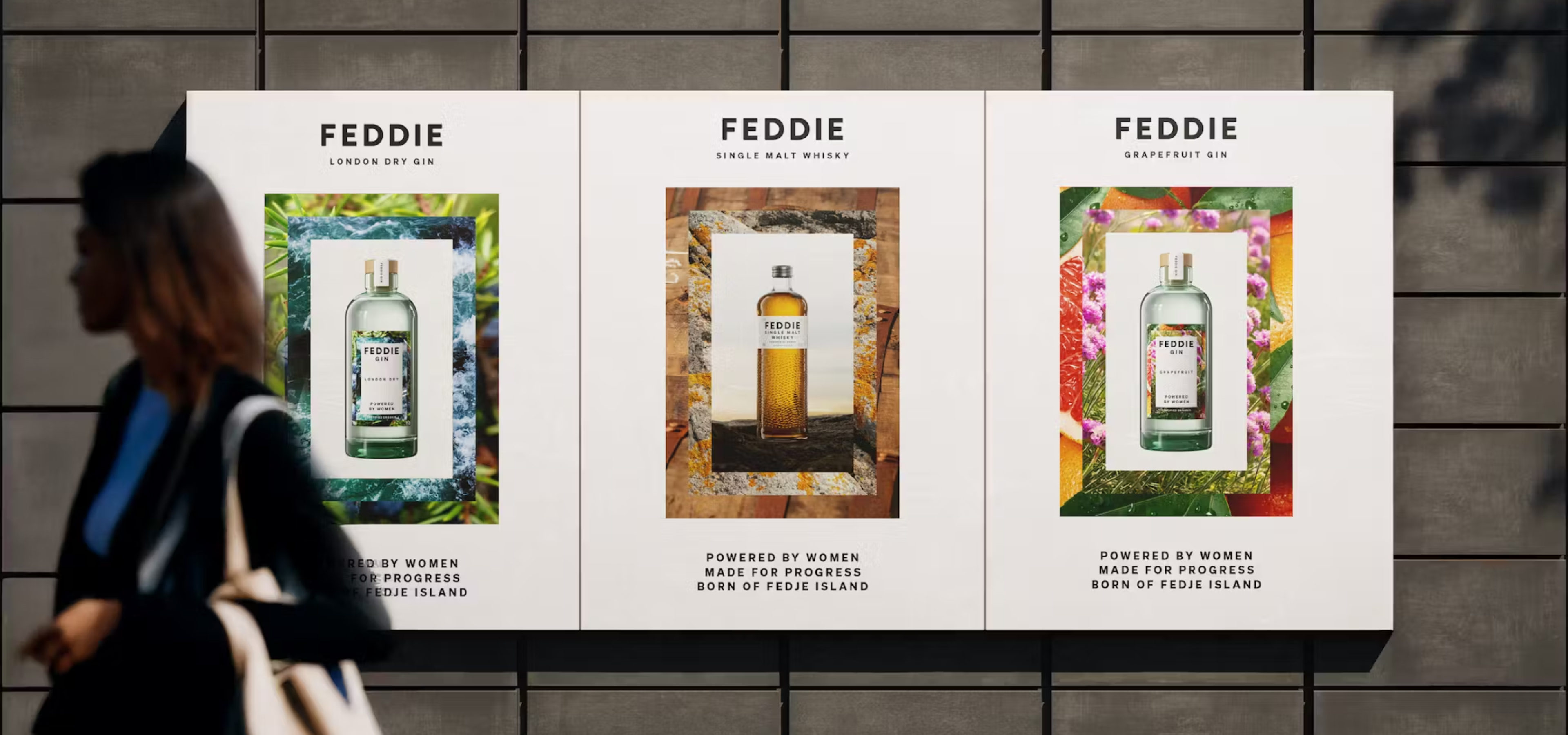
Meanwhile, in Norway, Feddie Distillery is quietly reshaping what whiskey looks like and who it’s made for. The brand, funded entirely by women, worked with Contagious to create a bottle design rich in meaning and detail.
Each bottle features 750 dots, representing the number of investors at the time and 521 dashes, one for every resident on Fedje, the small island where the distillery is based. The result is minimal yet deeply symbolic, a design that reclaims a traditionally male-dominated space and opens it up to everyone.
It’s a brilliant example of how thoughtful design choices can reshape audience perception and make heritage industries feel more inclusive, one dot at a time.
Contact us