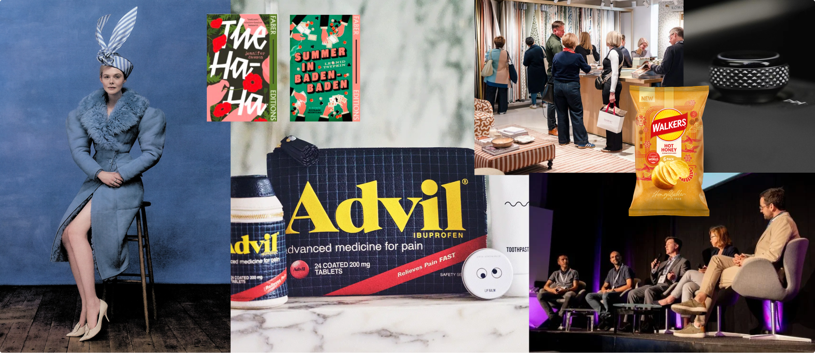
A small collection of design inspiration that sparked conversation around the studio, including playful, tactile campaigns, thoughtful rebrands and product decisions that put people first. These are the details that reminded us why good design really matters.
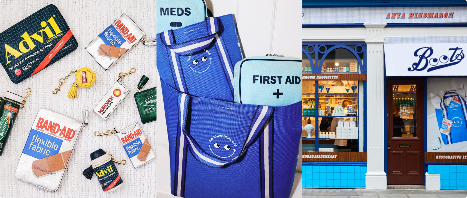
It all starts with joy, the kind that comes from turning the everyday into something collectible.
Anya Hindmarch’s growing “village” of shops in London continues to delight us and her latest collaboration with Boots is no exception. Reimagining everyday cosmetic objects as playful, eye-adorned keepsakes, it’s the kind of design that every trinket-loving Londoner will happily queue for.
The standout favourite in the studio has to be the little Carmex coin purse, to us equal parts nostalgic and charming. It’s a reminder that great design doesn’t have to reinvent the wheel, sometimes it simply reframes the familiar, elevating ordinary objects into something worth collecting.
That same idea for design that serves real people, not just aesthetics, shows up in a very different context next.
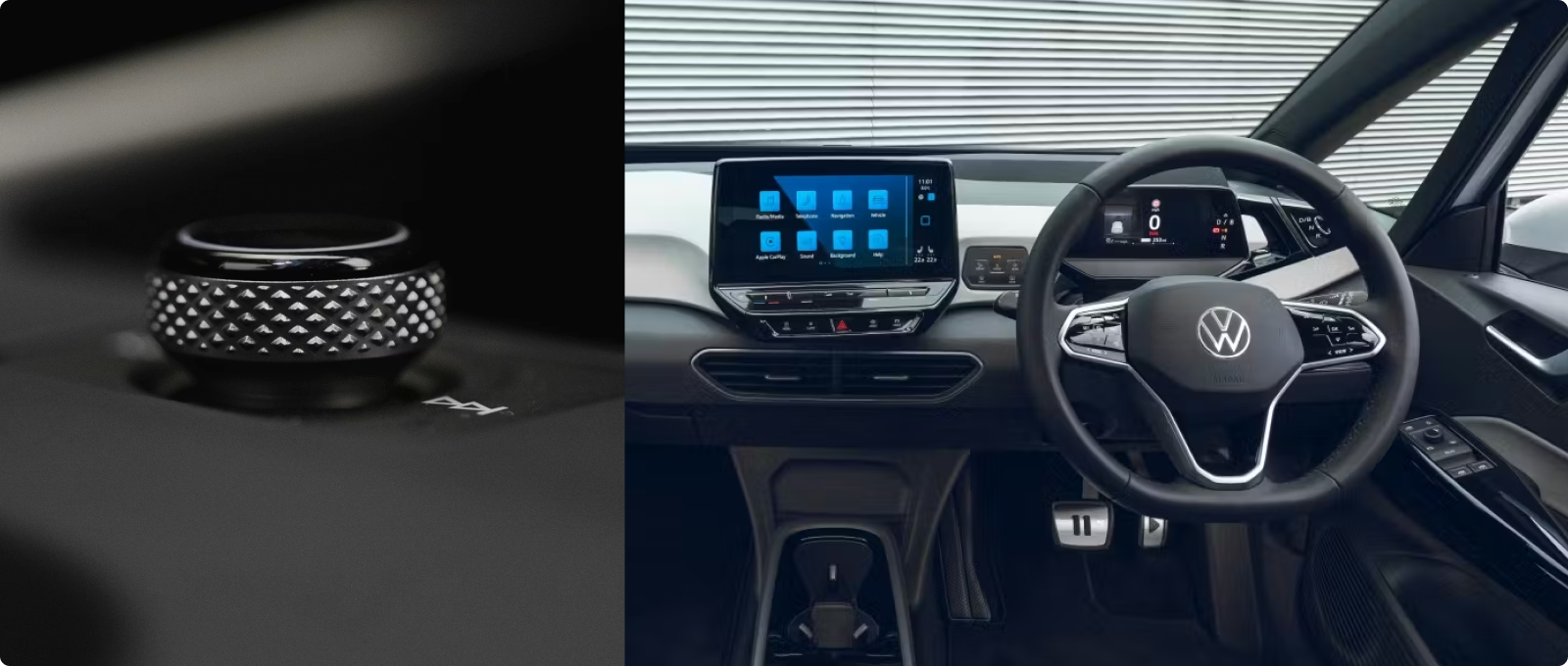
Volkswagen’s decision to bring back physical buttons feels like a rare and refreshing admission that a company got something wrong. Earlier models like the ID.3 and Mk VIII Golf were criticised for prioritising sleek, touch-heavy interiors over usability, with unlit sliders and haptic controls that looked good but frustrated drivers, especially at night.
The latest interiors mark a clear course correction. Key functions are once again physical, easy to locate by feel and designed around muscle memory, while screens are used where they actually add value.
As designers, we’re taught that great UX puts people first and that’s exactly what VW have done here. Good design doesn’t always have to be about more tech, it’s about knowing when less (and more familiar) is better.
That confidence to step back and embrace what already works is something we’ve also seen play out in branding.
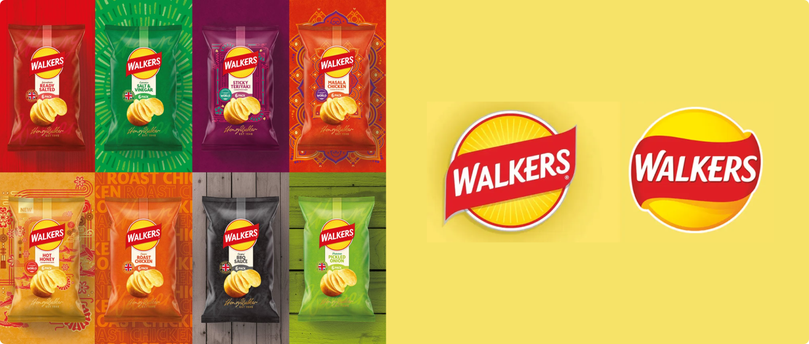
Walkers’ biggest logo change in nearly 80 years has sparked plenty of debate in the design world. Created by their in-house team, PepsiCo Design + Innovation, what stands out most to us is the confidence behind it.
Rather than doubling down on the ultra-minimal look, the brand is leaning back into its essence, which relies on warmth, heritage and recognisability. The new sun motif and richer visual language on the packaging feel like a deliberate move towards storytelling, without staying too much from the signature Walkers look.
In a crowded crisp aisle, it’s refreshing to see a legacy brand embrace what makes it them. Betting on character, confidence and being instantly recognised, we love to see it.
That sense of restraint and long-term thinking carries through into our next design delight.
Another project we’ve been talking about in the studio is Faber Editions’ ongoing cover redesign series. Led by art director Pete Adlington, the project has been quietly evolving since 2021, breathing new life into classic titles through a confident, typography-first approach.
What we love most is the balance. Each cover feels distinct, capturing the essence of its book in a way that feels considered and contemporary, while maintaining a clear sense of cohesion across the series.
It’s a great example of how strong typographic thinking and restraint can do the heavy lifting. Different voices, different moods, one thoughtful system. Exactly the kind of design evolution we enjoy seeing done slowly and with care.
And finally, a reminder that craft and play still have a powerful role to play, especially in a digital-first world.
Elle Fanning’s latest Who What Wear photoshoot has been all over our feeds this week and for good reason. It feels genuinely refreshing. Playful, tactile and full of hand-painted, cut-out cardboard elements, the shoot leans into a nostalgic, retro aesthetic that celebrates craft over polish.
In a time where digital tools and AI-generated visuals are everywhere, seeing a campaign embrace physical, analogue techniques feels like a breath of fresh air. This is the kind of creativity we love: expressive, human and slightly imperfect.
It also reminded us why tactile exploration still matters, much like the analogue-first advertising approach we wrote about recently with Ffern. Read more about it here.
Contact us